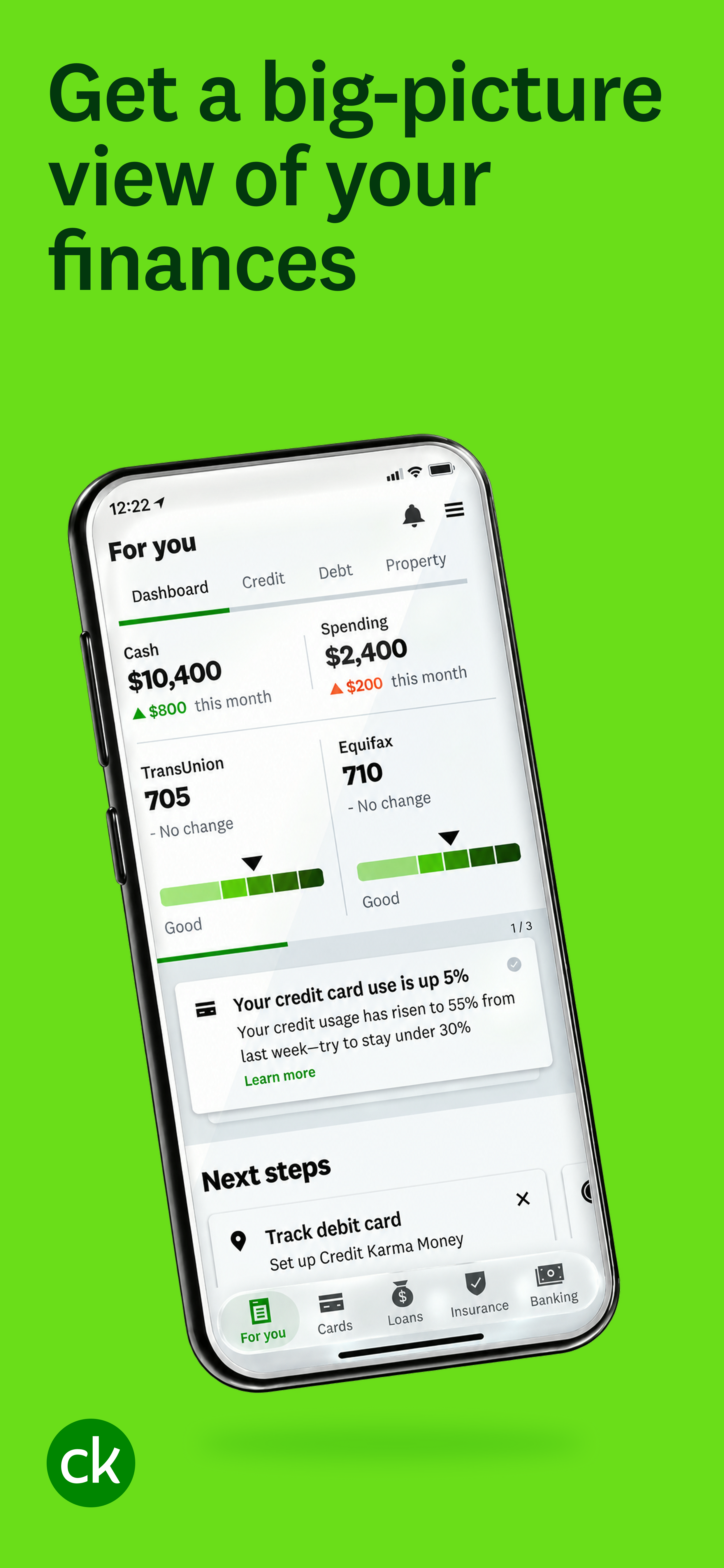
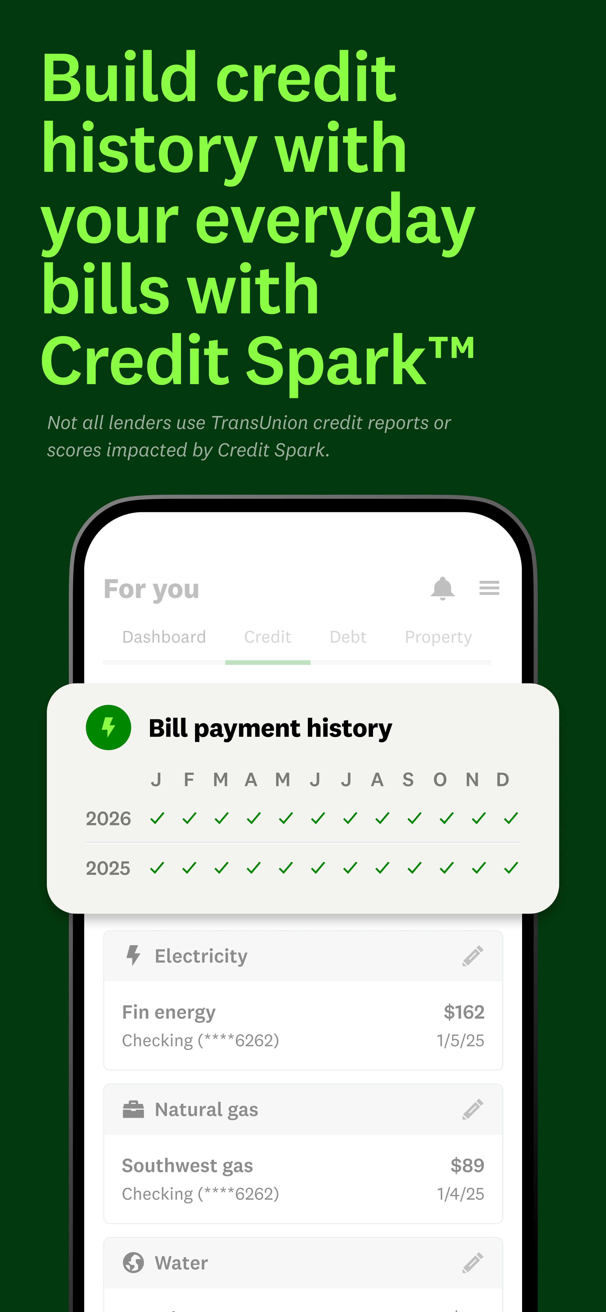
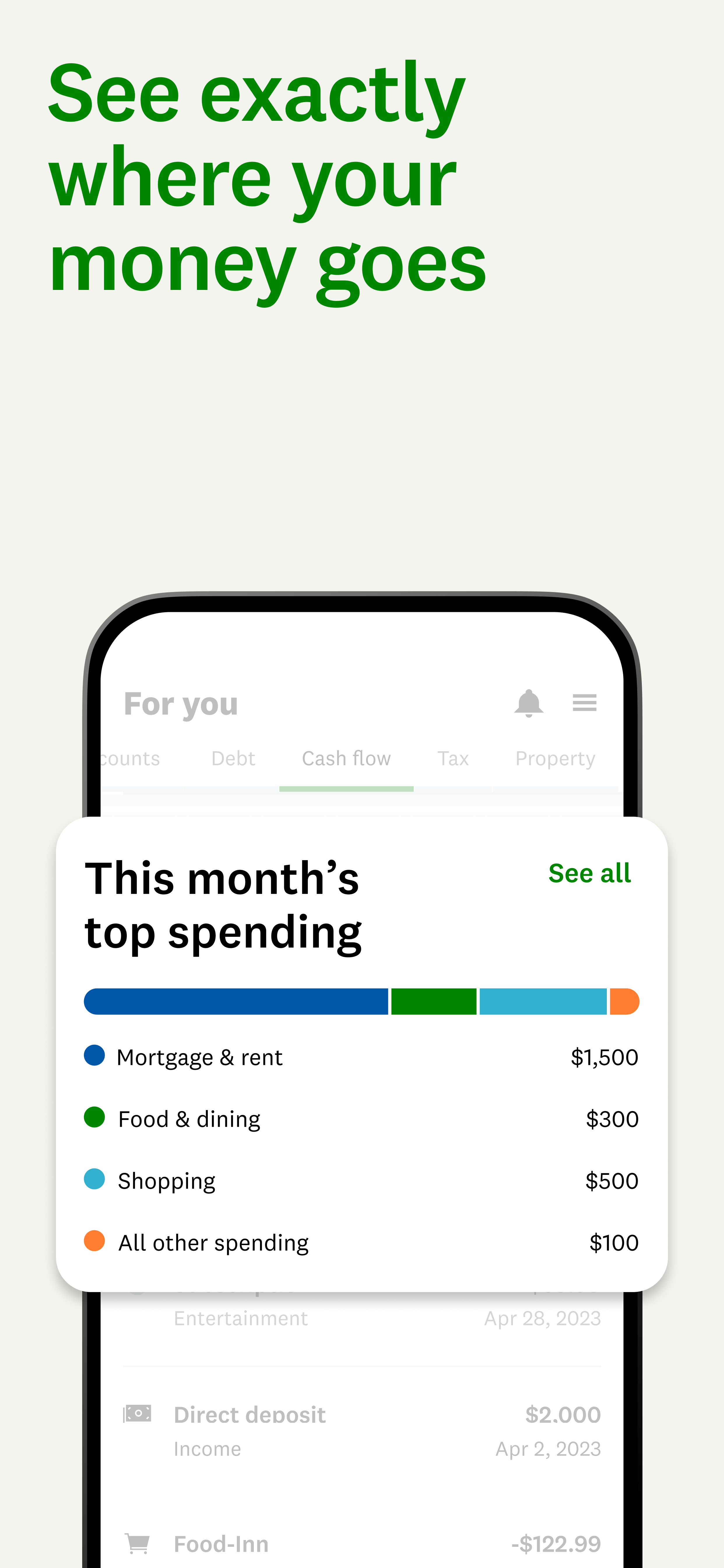
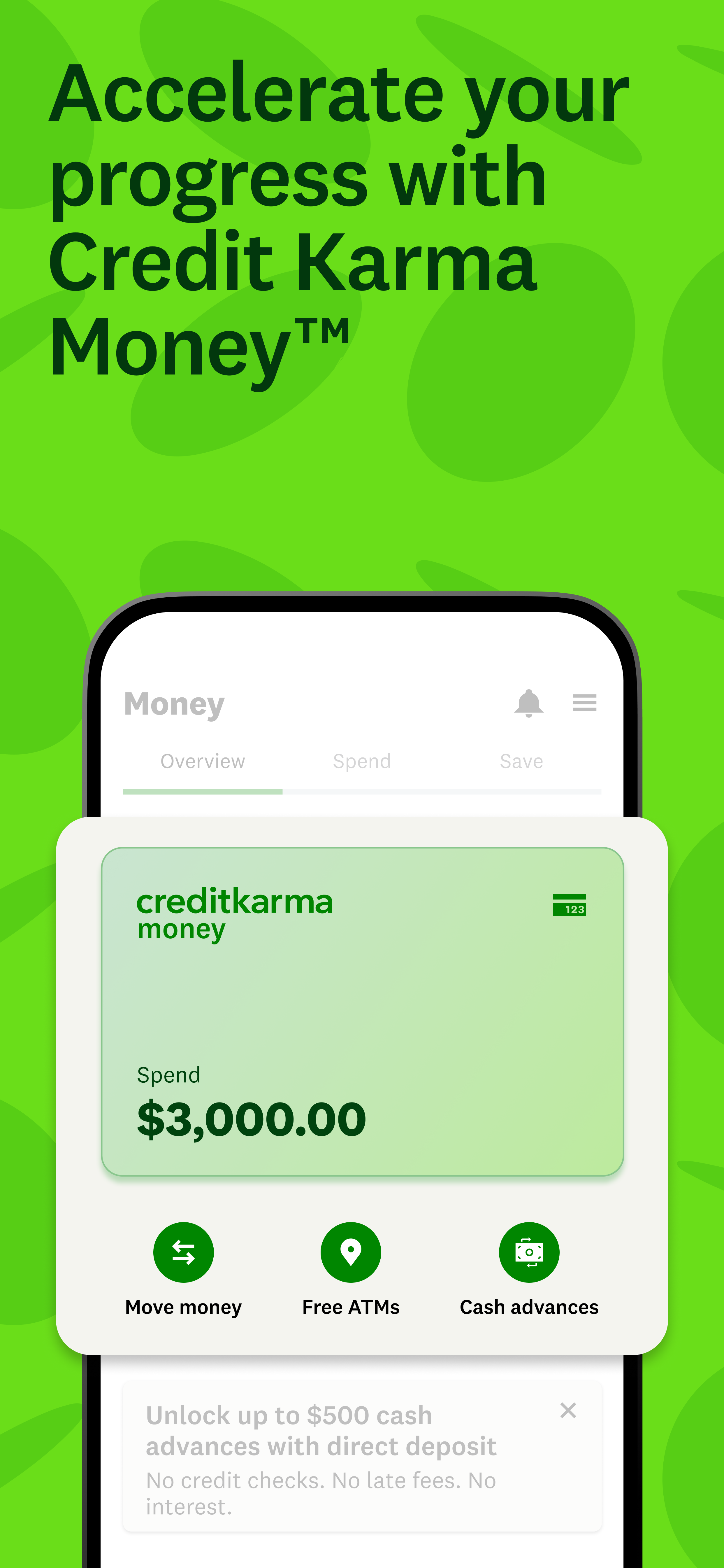
App Store
Before the Download
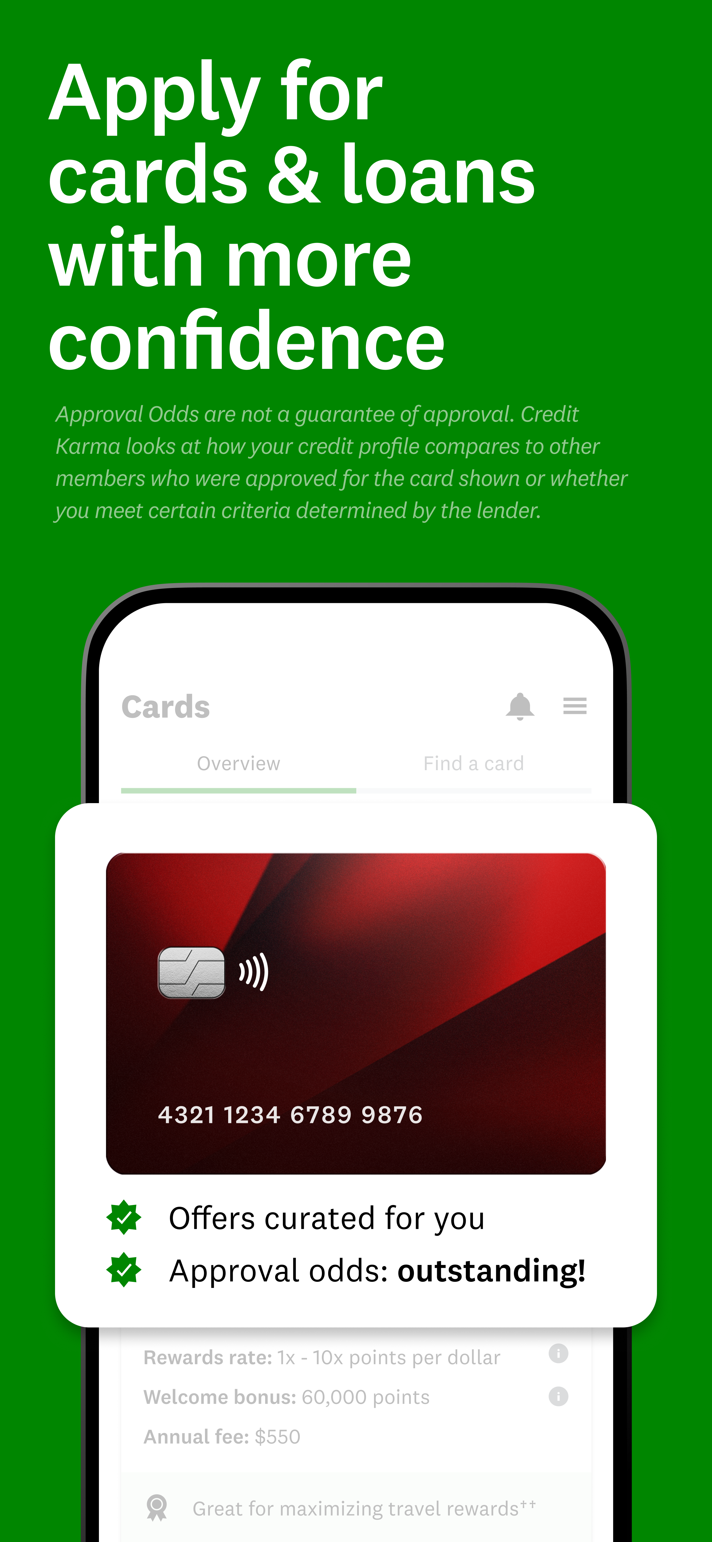
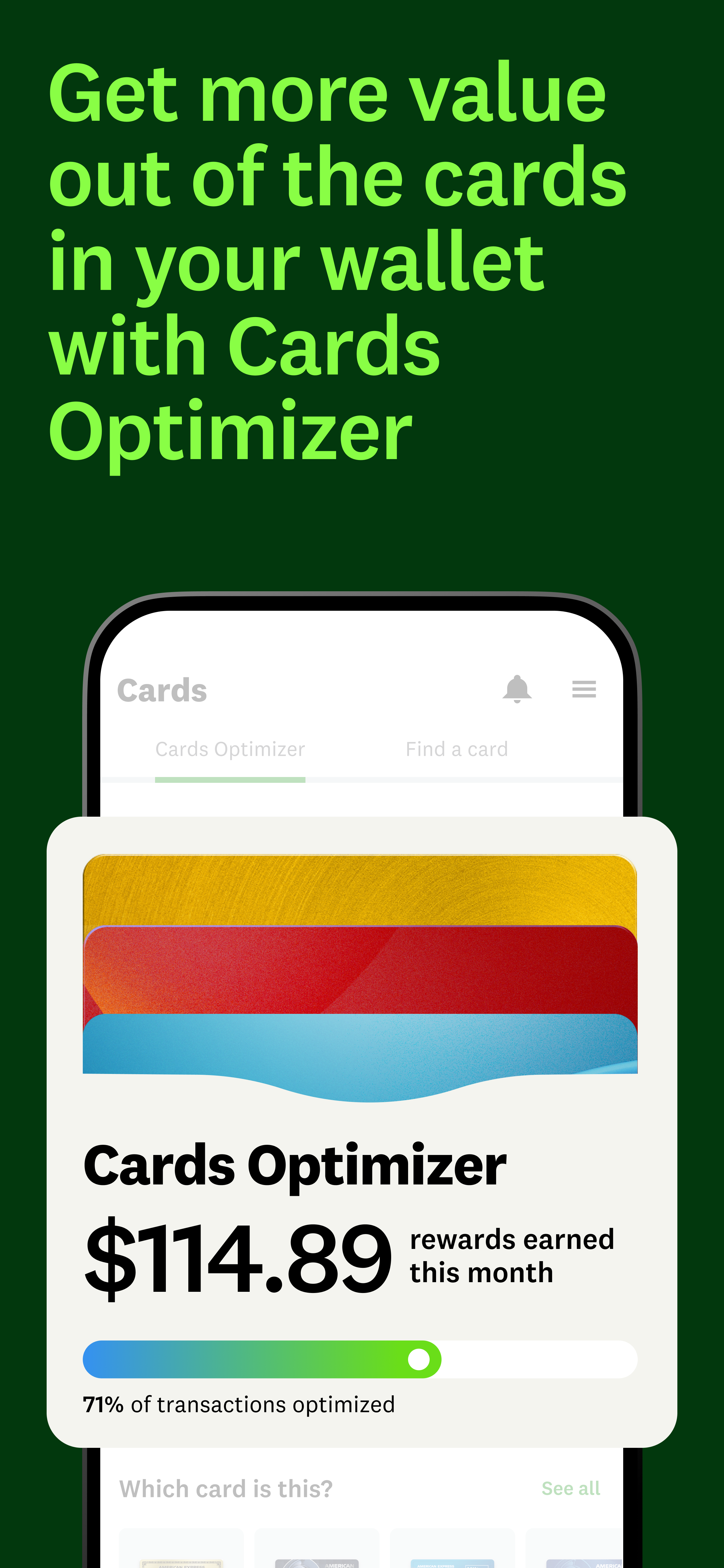
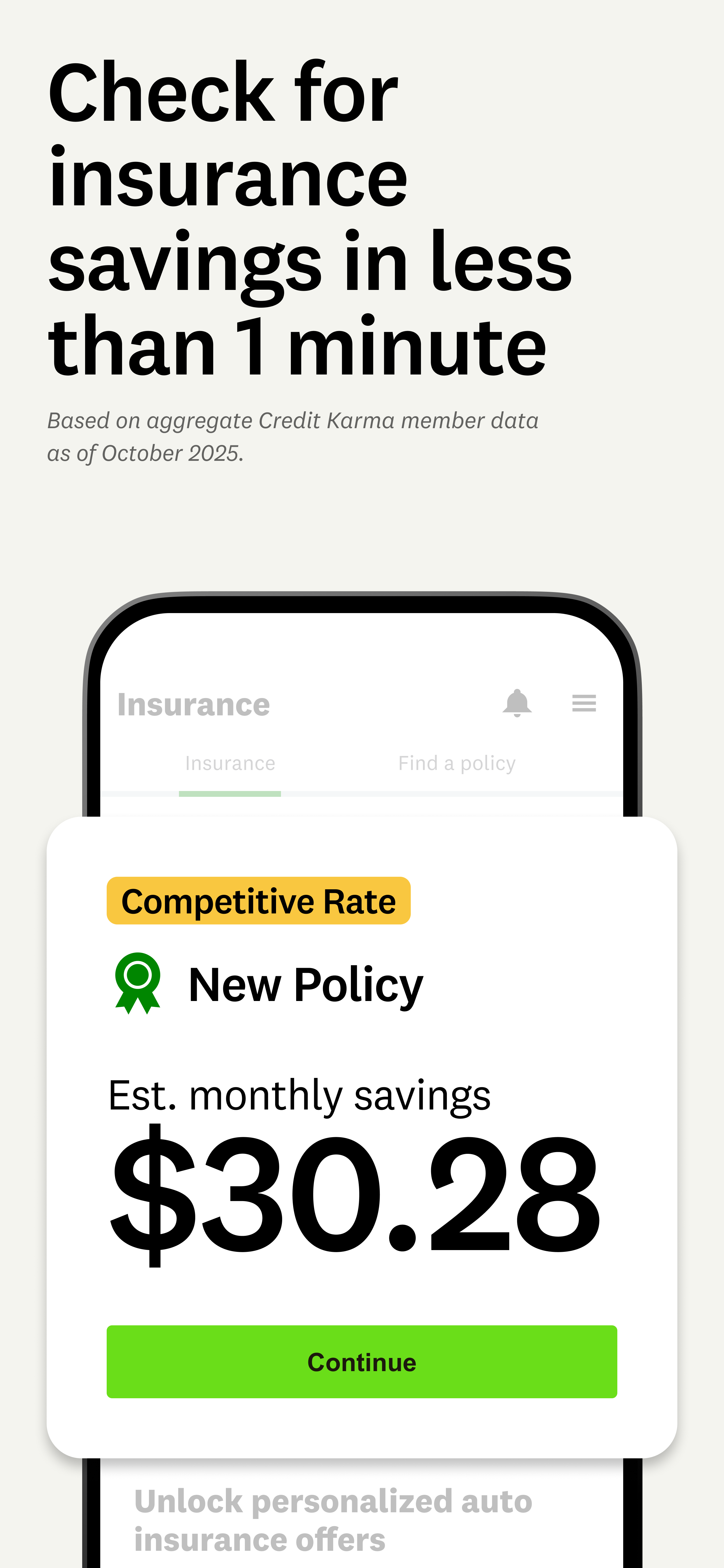
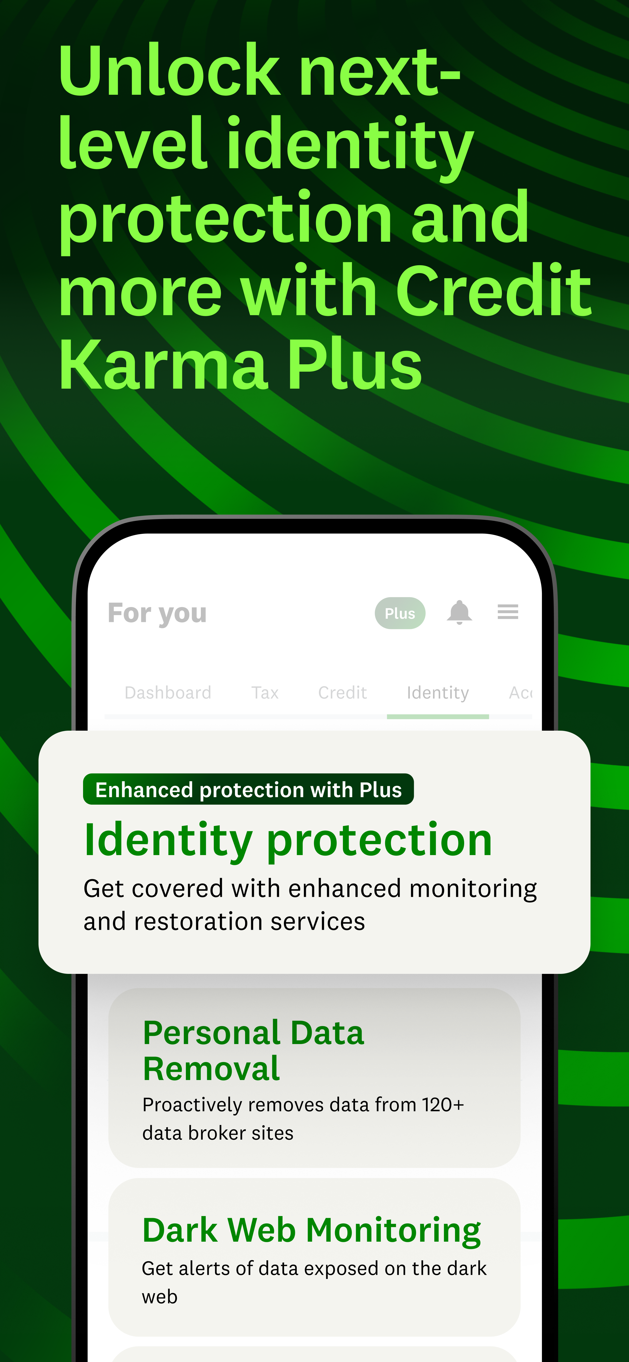
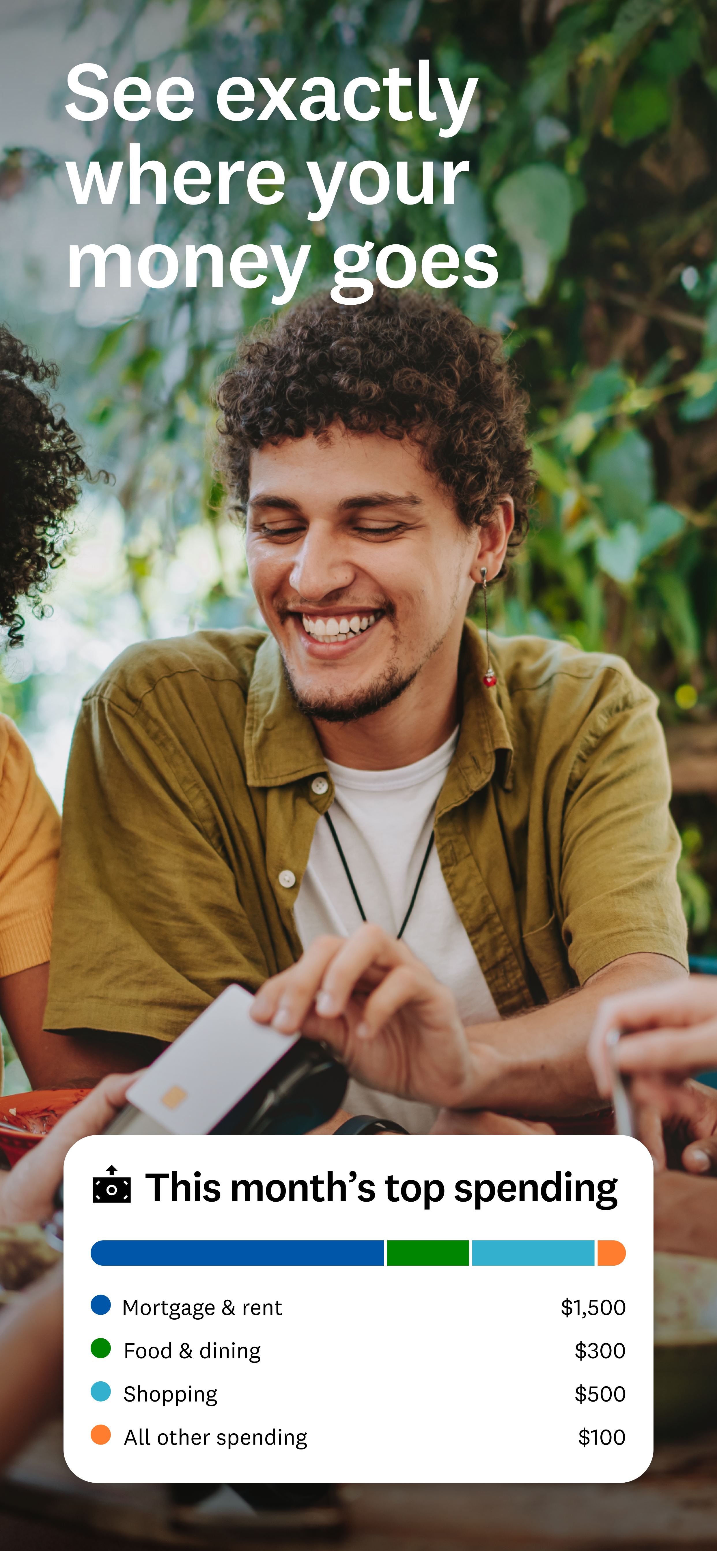
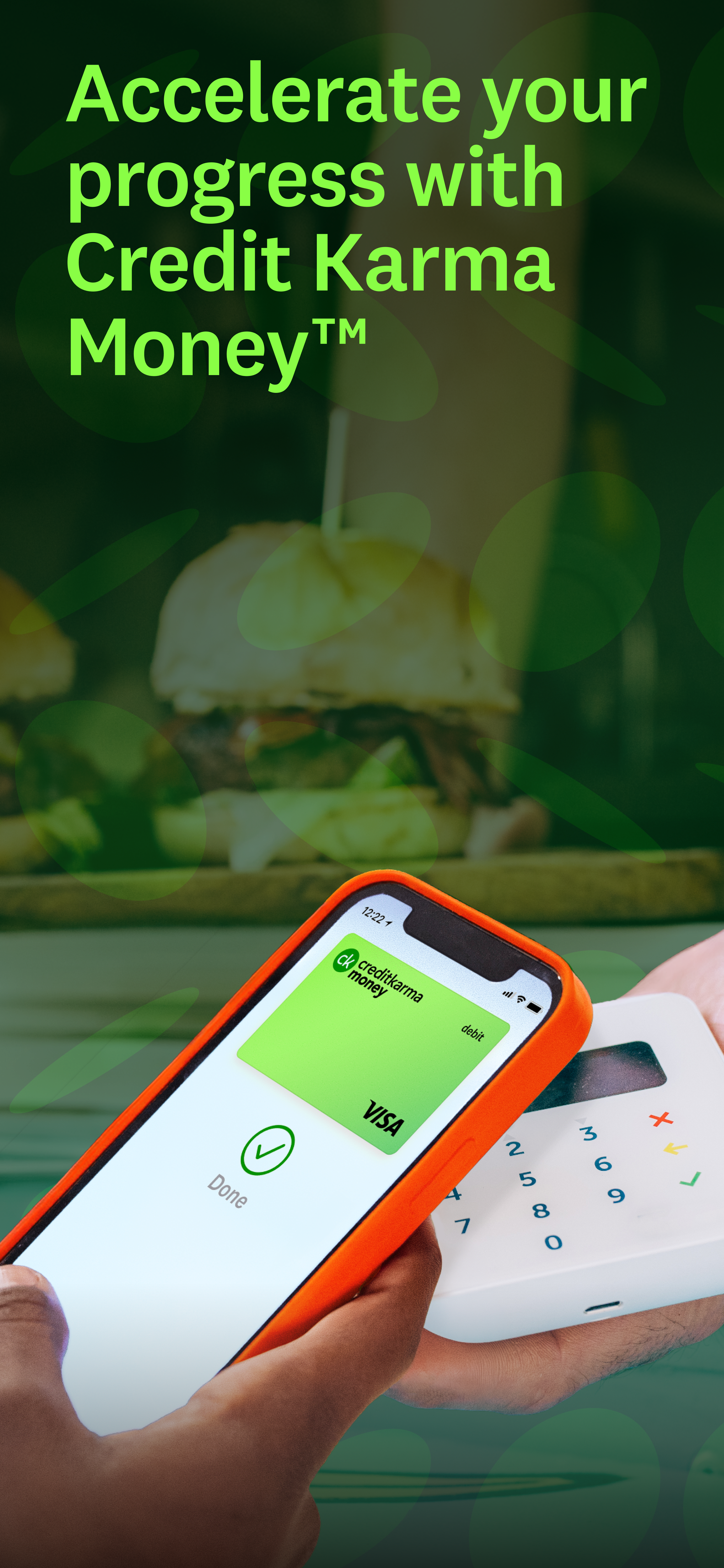
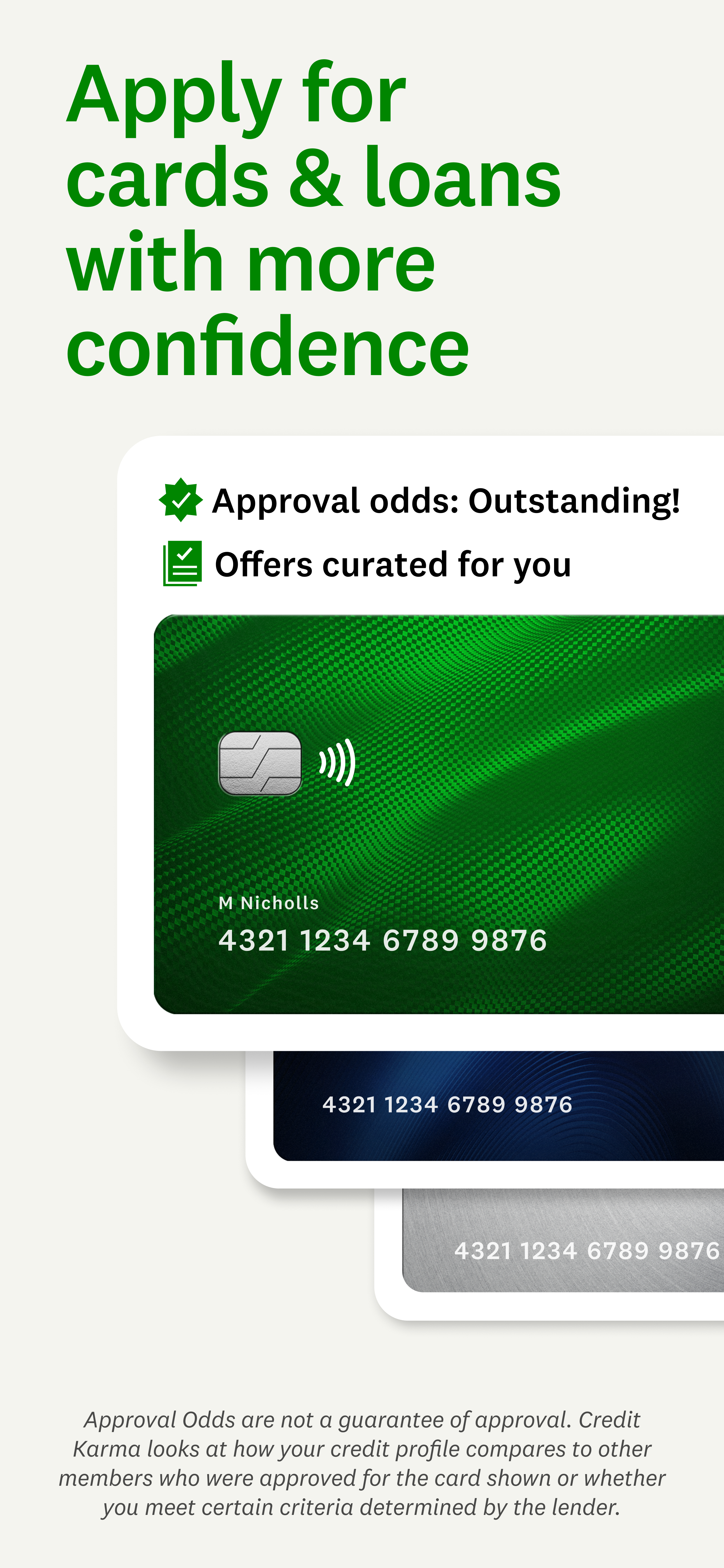
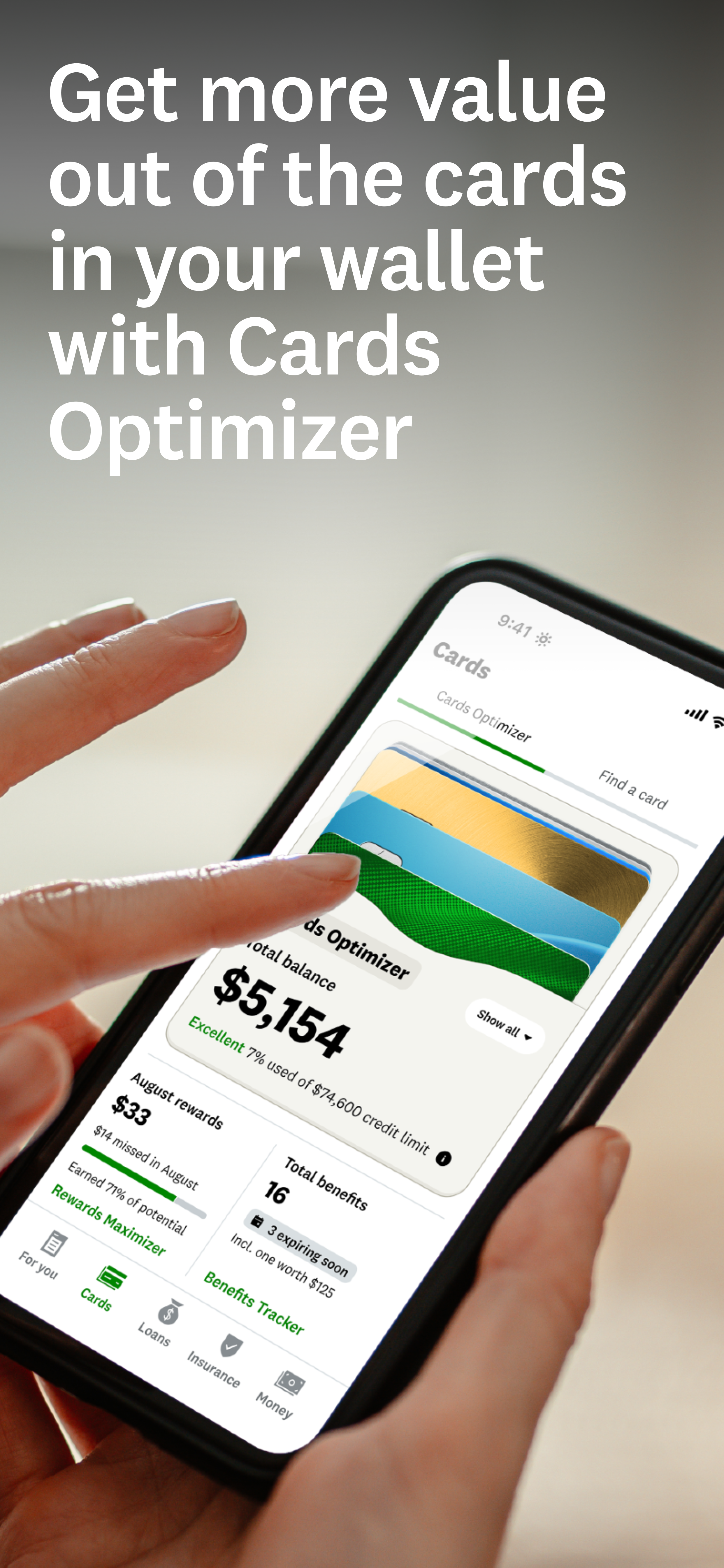
Every visitor arrives for a different reason. These store screens give all of them a clear way to begin.
Deliverables
Android and iOS
- 1 app preview video
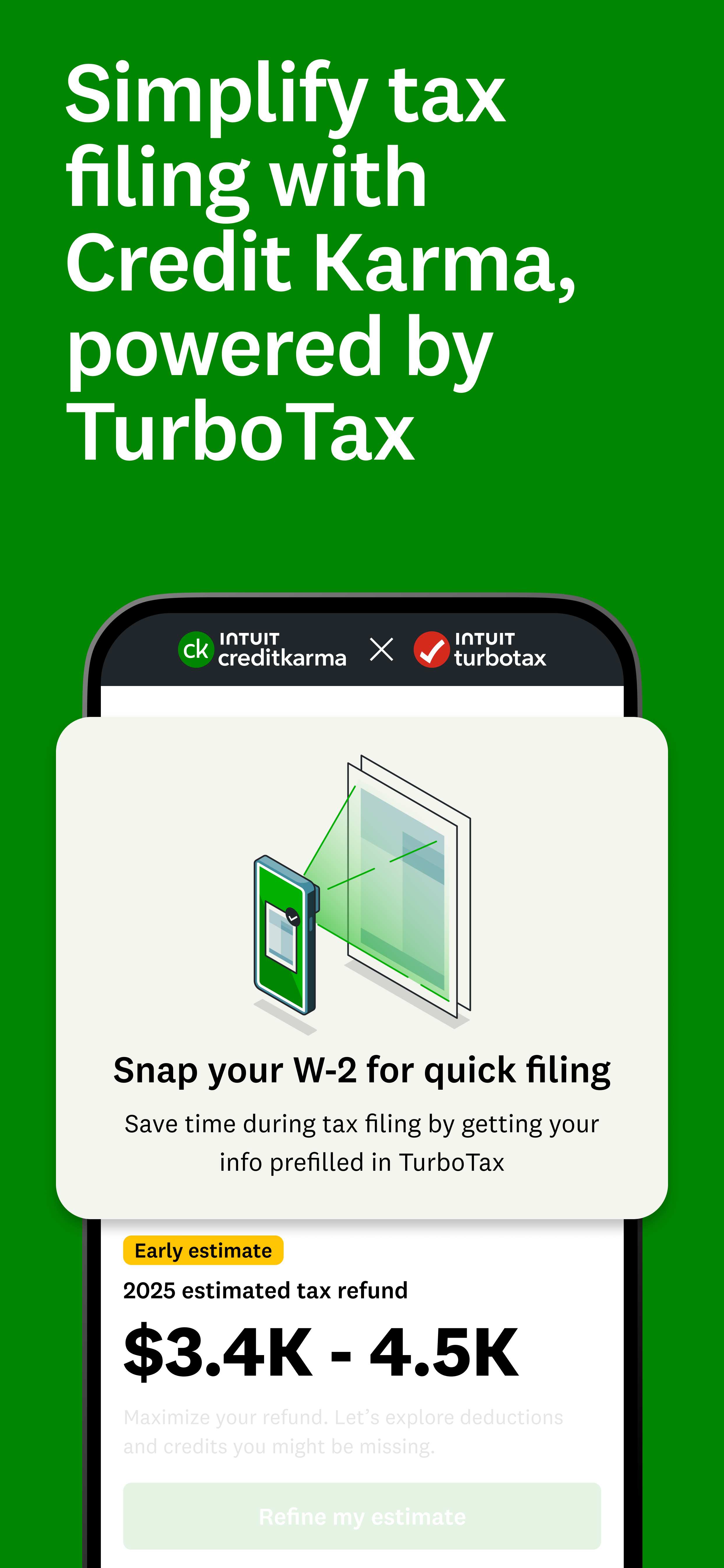
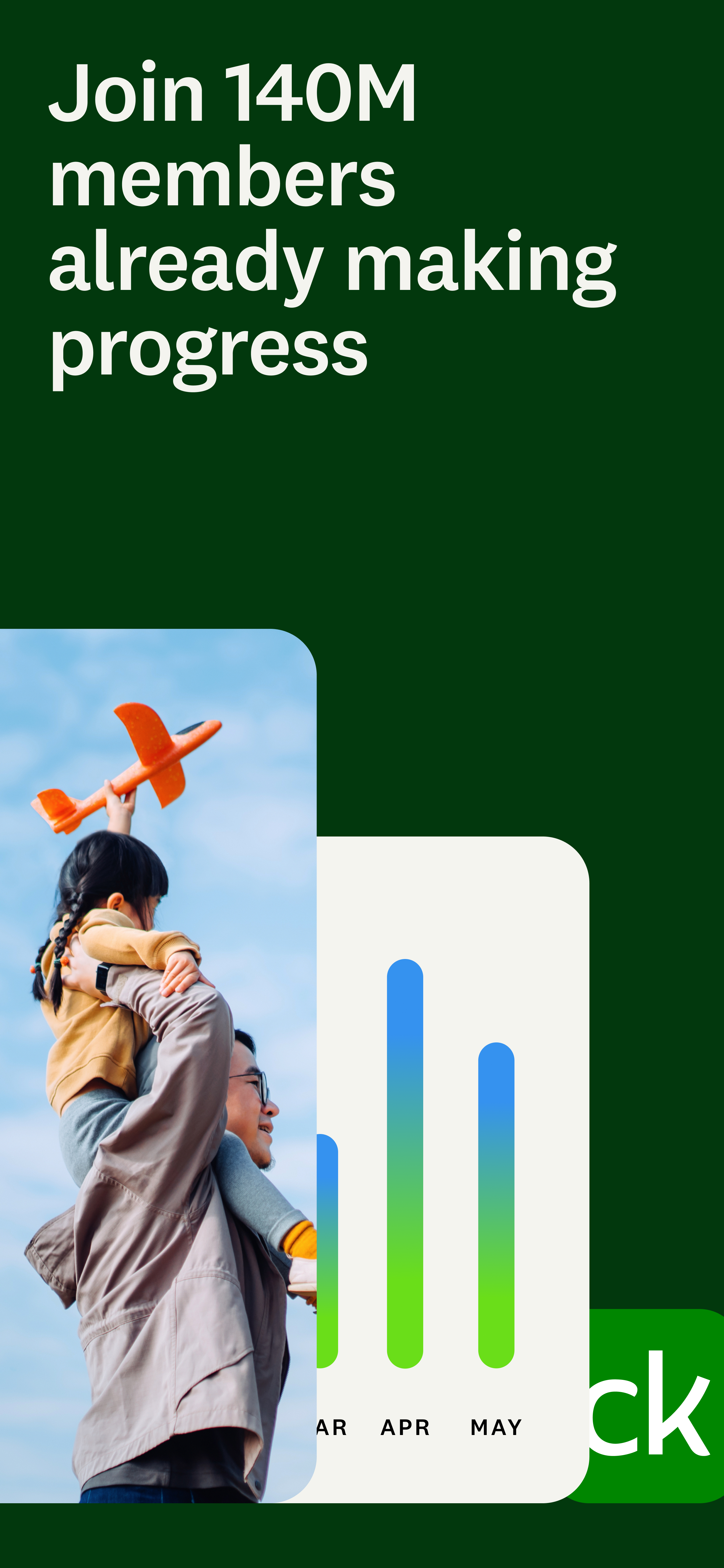
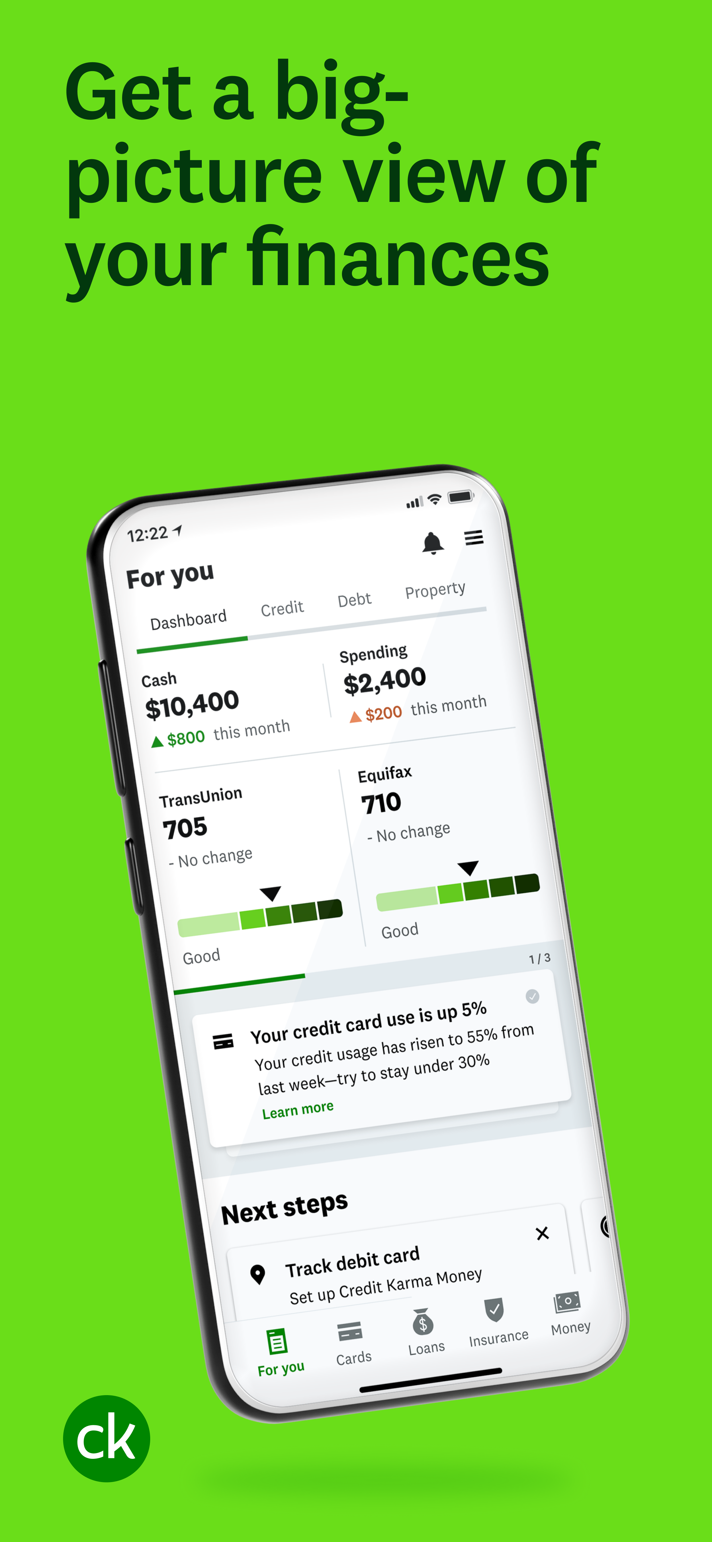
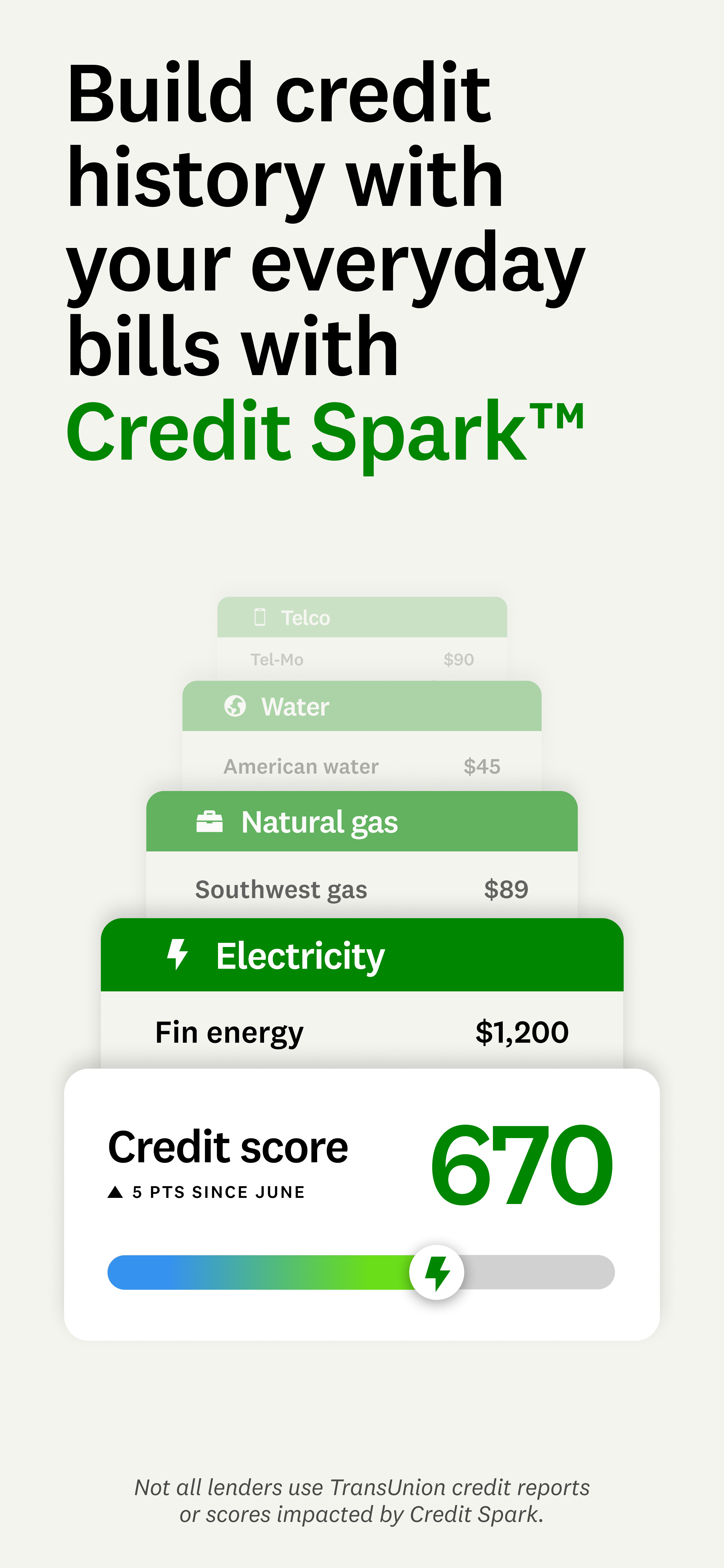
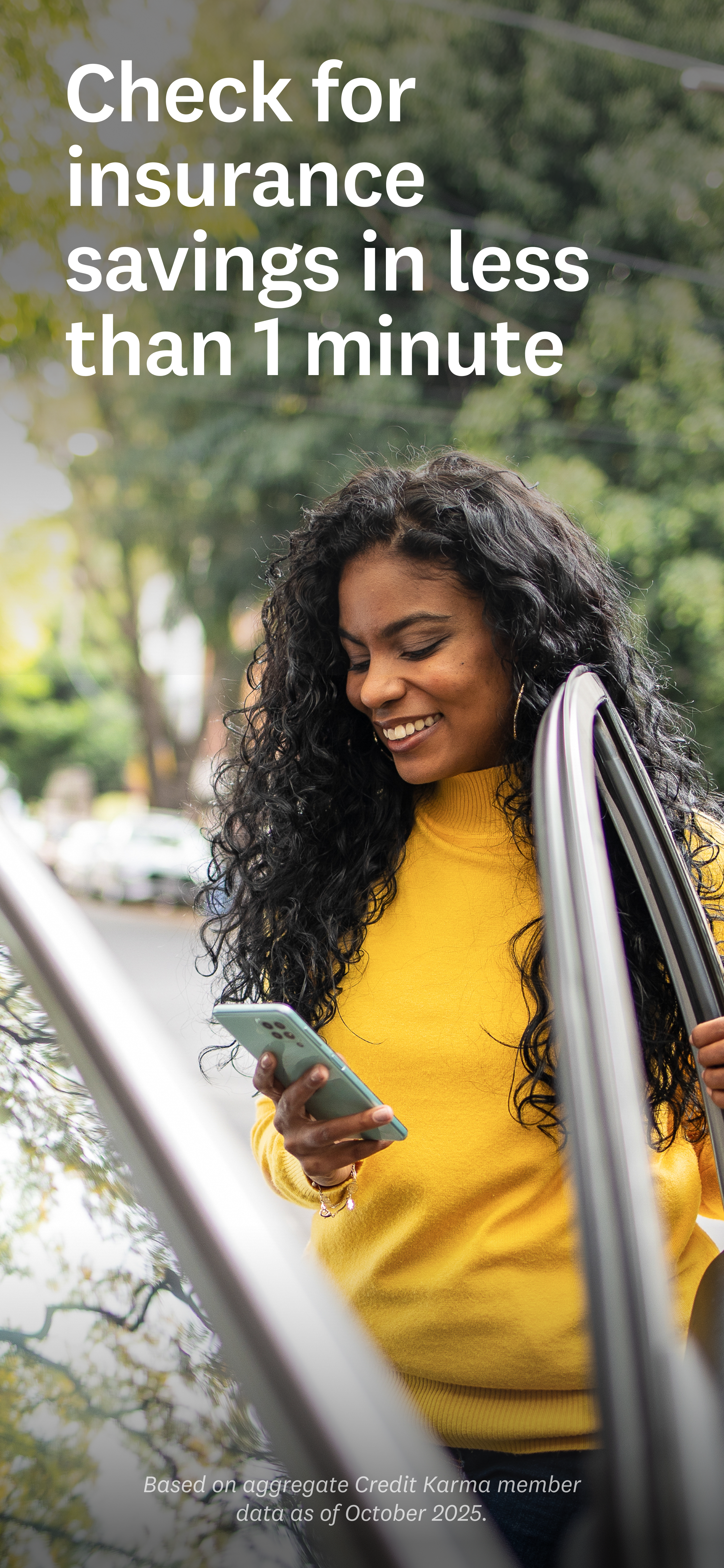
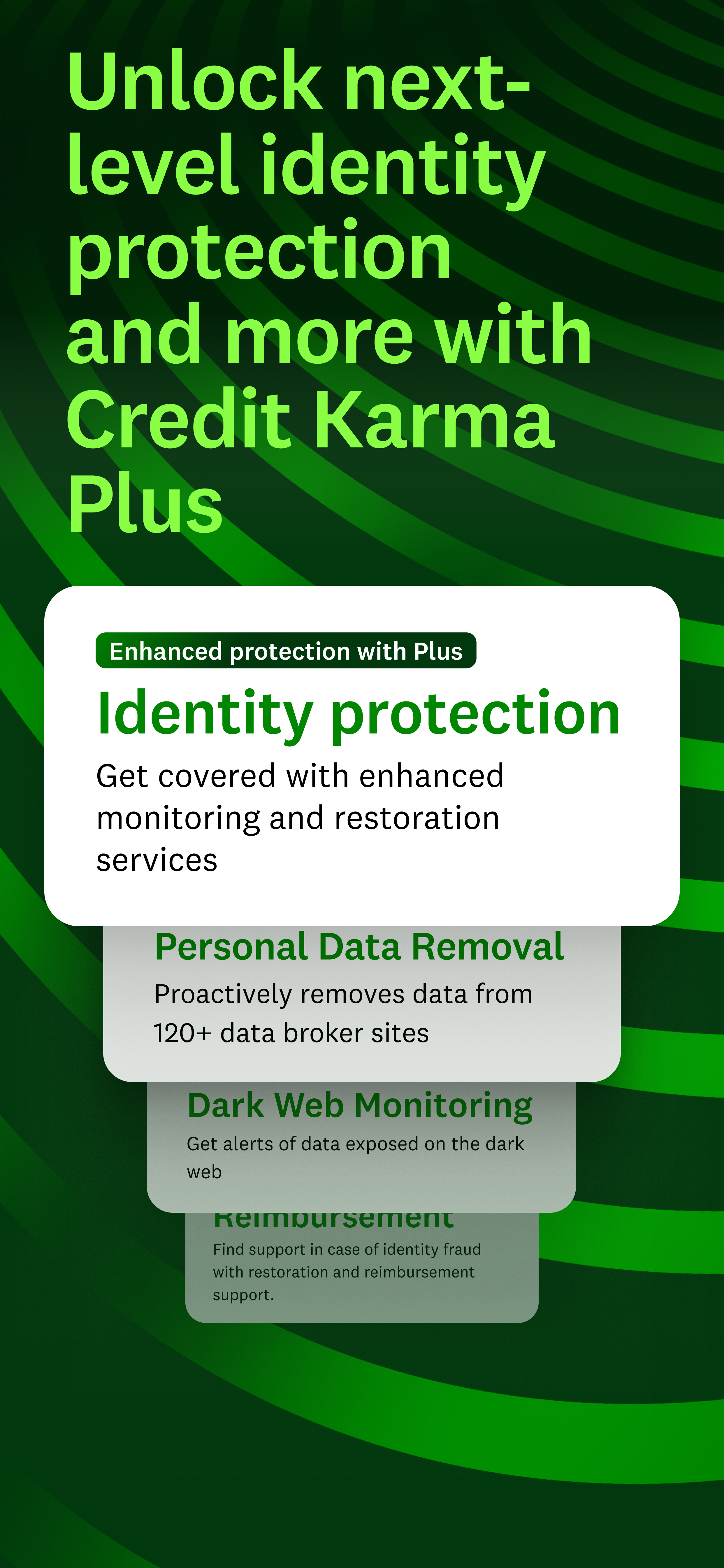
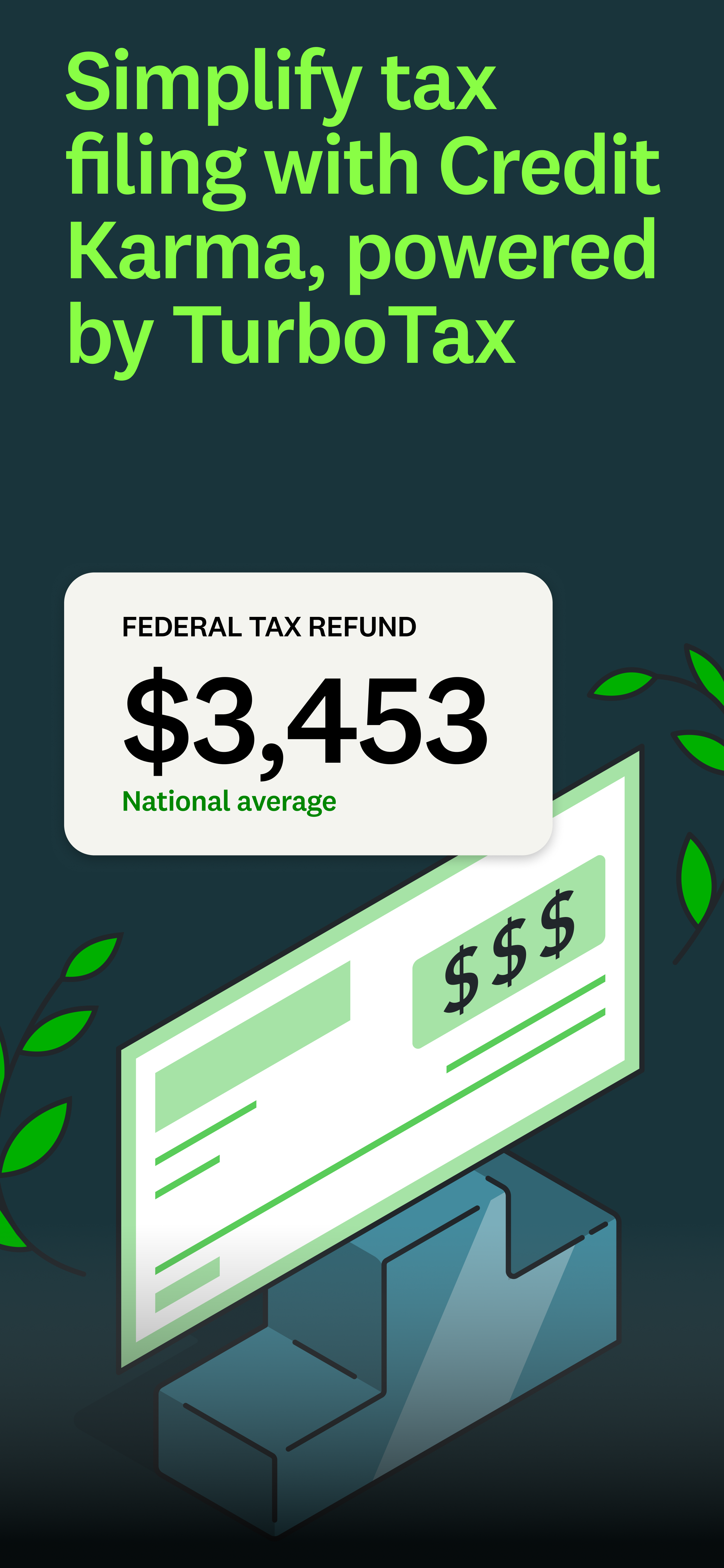
- App Store and Google Play screens (21: 11 Android, 10 iOS)
Brief recap
App Store visitors decide fast. If relevance isn't clear, they move on without downloading. The brief asked for refreshed store screens built around one message: no matter what brings you in, there's a way to begin.
Off-brief, on-strategy
The brief called for building on the previous design, so I delivered that. I also designed a second option shaped by our new brand guidelines, with more life and our photography and UI used the way they appear across emails and landing pages. Both were on brand, and the team loved the second, but a short timeline and some Apple guideline adjustments meant they went with the first.
No product content was handed to me, so I sourced it myself: digging through the product files in Figma, asking our product partners which features made the most sense to show, and working with legal to make sure every number on screen, from credit scores to spending, felt realistic and approachable to members.